B2B Client Dashboard @Brarista
As Brarista scaled, managing B2B client conversations across WhatsApp, Trello, and ClickUp created inefficiency and quietly eroded client trust. I led the design of a centralised dashboard to address this fragmentation, driving the process from discovery through MVP and coordinating cross-functional delivery between design and engineering.
This case study focuses on the design process and learnings; specific UI details remain under NDA.
Year
June - September 2025
Disciplines
UX Research
Product Design
Problem
Dissecting and Comprehending the Problem 🤓
We initially assumed the key challenge was streamlining client requests. It sounded reasonable, yet it remained an inside-out assumption, shaped more by our internal pain than by the clients’ lived experience.

An adapted Double Diamond process validated ideas early and reduced wasted development time.
Understanding the problem is the foundation of any meaningful solution. To ground it in reality, we used a mixed-method approach:
Client Interviews
Two clients, one long-term partner familiar with our system and one new client still navigating onboarding. This contrast helped us understand both ends of the adoption curve.
Internal Brainstorming
Collaborative sessions with the founder and engineers to surface operational bottlenecks.
Data Analytics
A review of chatbot logs and performance metrics to assess what patterns were visible and what was technically attainable.
Each interview followed principles from The Mom Test, asking specific, past-oriented questions instead of hypothetical ones. I listened more than I spoke, looking for behavioural truth rather than surface-level preference.

Interview guide on Notion.
Research reframed the problem. While streamlining requests mattered, clients' deeper frustration was lack of visibility. They couldn't see how the chatbot performed or what insights lived within the data.
We realised chatbot logs contained valuable traces of consumer behaviour: fit issues, size distributions, shopper patterns. In an industry built on intimacy and personalisation, these were stories that could guide retailers' marketing and product decisions.
Ultimately, we understood that our clients wanted to hear the conversations through data and understand their consumers at scale.
The problem shifted from operational efficiency to trust and transparency. Success meant giving clients the visibility and insights they needed to make confident decisions.
From this, we defined three guiding hypotheses:
Visibility & Trust
Providing clients with real-time, intuitive access to chatbot performance metrics would strengthen transparency and reinforce confidence in our service.
Actionable Insight
Turning conversational data into behavioural and demographic insights would help clients make smarter business decisions and position Brarista as a strategic partner rather than a vendor.
Operational Cohesion
Centralising client communication and analytics would reduce friction, accelerate response times, and create a more cohesive client experience.
Design
Agile, Iterative Design 🧐
The design process unfolded through agile cycles of iteration, prototyping, and testing. Concepts were drafted in Figma, tested internally and with select clients, then refined through rapid feedback loops.
To balance agility with structure, I used an agile user story framework and MoSCoW prioritisation to clarify what needed to be built first, aligning design scope with engineering capacity.

User story documentation on ClickUp.
Handoff was a phase of co-creation between design and engineering. User stories were finalised to articulate each feature's purpose and outcome, then linked directly to an interactive Figma prototype as a shared source of truth.
With engineers working remotely across a 6-hour time difference, I prioritised clarity over formality. I used annotated Figma files, video walkthroughs, or live sessions depending on context. Quick calls often resolved nuanced interactions faster than tickets. QA followed the same iterative cycle.
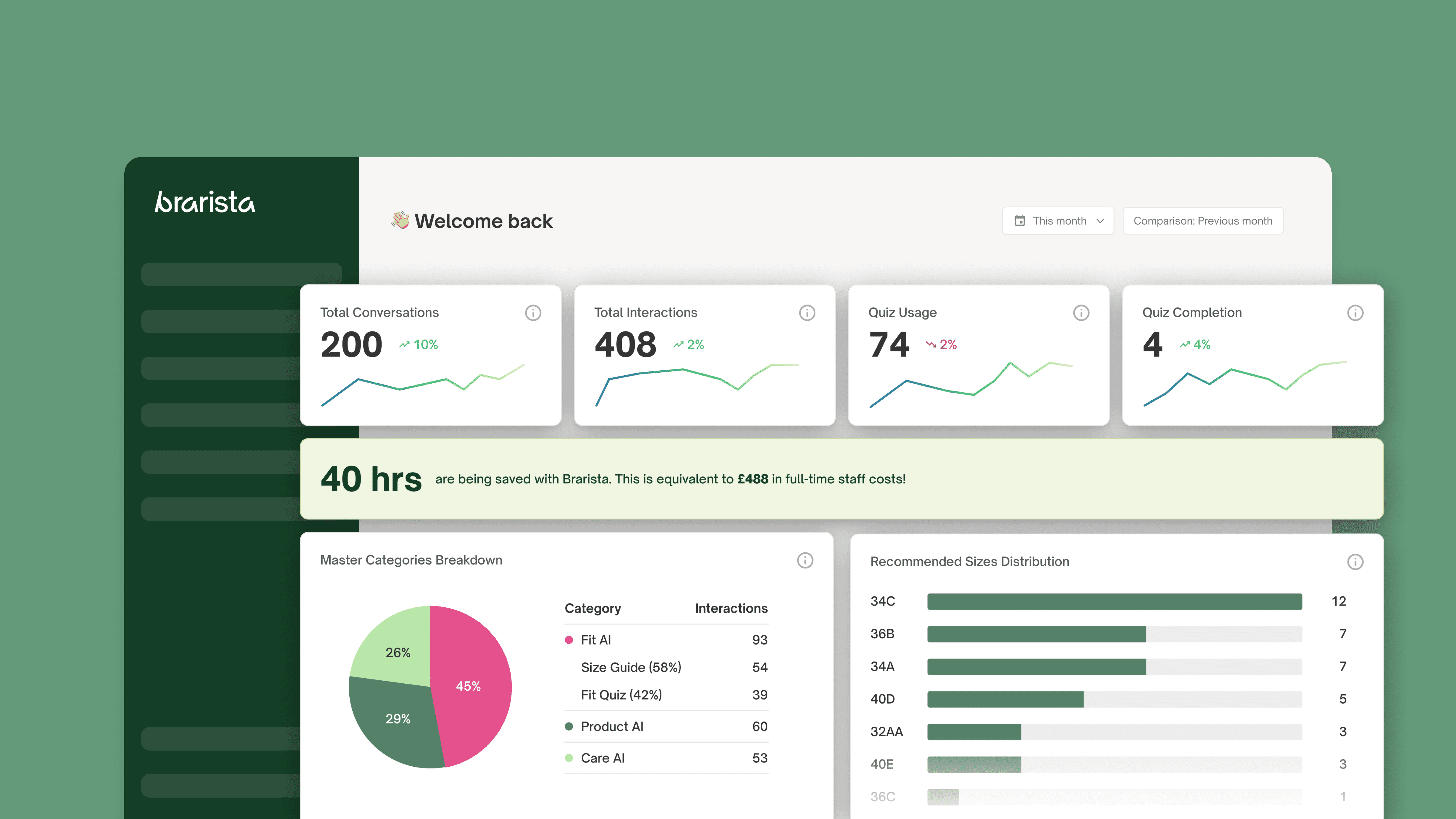
The result was an MVP that aligned client expectations with Brarista's strategic objectives. The dashboard's first release includes:
Real-time Visibility into Performance
Engagement summaries and conversion analytics
ROI and attributed order tracking
Transparent access to full conversation logs
Exposure to Behavioural Insights
Thematic conversation categorisation
Detailed size distribution and fit-related analytics
Insights into bra-wearing habits
Streamlined Operational Communication
Centralised dashboard integrating requests, data, and updates in one coherent space
Learnings
Midway Takeaways 🤠
This project unfolded as both a design challenge and a systems lesson. Building Brarista’s B2B dashboard meant navigating not just user experience, but collaboration that make design operationally real.
Never Assume
What we think clients want and what they actually need are rarely identical. Early assumptions around efficiency evolved into insights about visibility and trust. This required continuous alignment across all stakeholders (i.e. clients, founder, and engineers) to ensure priorities reflected both user value and business reality.
Good Design Requires Good Rapport
No amount of documentation replaces human connection. The closer I worked with developers, the smoother and more meaningful the handoff became. Live QA reviews built shared understanding far faster than long written specs.
Systems Thinking Strengthens Design Outcomes
Having foundational knowledge in software engineering shaped how I structured user stories, prioritised development scope, and defined acceptance criteria. This hybrid lens between design and systems thinking allowed for a product that was not just desirable, but buildable.